Lynx
Lynx
Lynx is your link-in-bio page: claim a public address, add every platform and link you have, and style the page to match your brand.
What it is
Lynx is your link-in-bio page: one public address that collects everything you do in one place. It lives at metryx.tools/u/yourname, works for visitors whether or not they have a Metryx account, and updates when you save your changes. Put it in your Instagram bio, your TikTok profile, your video descriptions, anywhere you only get one link.
There is no limit on links, and every design option is available on every plan. The only plan difference is the "Powered by Metryx" footer, which shows on Free and disappears on Standard and Pro.
Note
Creating your page
Your first visit creates an unpublished draft and opens Header. Work through Header, Content, Social Links, and Theme from the Lynx sidebar. Each screen keeps the configuration on the left and your complete live page preview on the right. The header, social links, sections, and footer stay visible while you move between configuration screens, so you always see how the pieces work together. The device frame makes it clear where the preview ends. Scroll to the bottom inside the phone to see the full Powered by Metryx footer.
Note
Header & social links
Header controls the top of your page. Pick a layout, upload a portrait or hero image, then show your name as text or replace it with a transparent logo. On the Hero layout the image fades into your page color, so the header still feels connected to the rest of the page.
Paste a profile URL and Lynx recognizes the platform, adds its icon, and lets you reorder it with the drag handle. Use Add a link for each place you want visitors to find you.
Note
Blocks
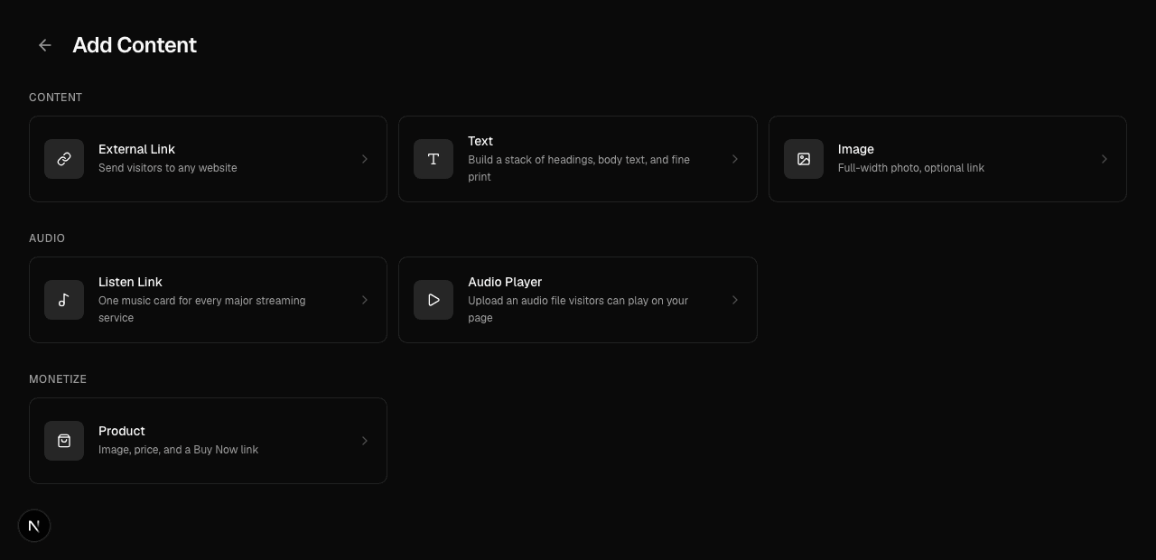
Content is organized into named sections. The things inside a section are called elements: links, text, images, products, Listen Links, uploaded audio and events. Add element opens a page of its own. Pick a type, fill in its settings on the page that follows, and select Add to section. Your phone preview stays beside it the whole time and updates while you type, change styles, align text, or reorder elements. Select any existing element in the outline, or its card inside the preview, to open those settings again. Elements with artwork show their thumbnail in the outline, while text-only ones stay clean and text-only. External links with a thumbnail appear as image-led cards on your public page. Image blocks keep the full image visible and use a blurred copy to fill the sides of their widescreen frame. Links without a thumbnail remain compact buttons. Drag an element by its handle to reorder it, or straight into another section: a line shows where it will land. Section handles reorder the sections themselves.
Uploading an image opens a crop step before the file is saved. Drag the image to reposition it and use the zoom control to choose the final frame. Product art and link thumbnails use a square crop. Image blocks let you choose Horizontal or Portrait before uploading. Horizontal uses the full widescreen frame. Portrait keeps the full image visible with blurred edge fill on your public page.
A Text element can hold several pieces of text. Add a Header, Normal text, or Fine print, then choose left, center, or right alignment for each one. Drag the handles to change their reading order. They stay together as one element in your section.
Note
Section layouts
Create section asks for the heading and the shape together, with a picture of each option: Stacked, Side by side, or Highlighted. Pick one and Lynx takes you straight into adding the first element. The shape is never locked in: Edit layout on the section changes it later.
A section is a named heading, plus everything inside it. Vertical stacks compact cards down the page. Horizontal creates a two-row shelf with navigation arrows and a partial next column while keeping its first card aligned with the section title. Highlighted gives Listen Links a larger card with quick streaming service icons and an animated More menu. Select the section name to edit it in place. Use Edit layout from its three-dot menu to reveal the layout controls.
The same menu can hide a section without deleting it. Hidden sections stay in your editor and disappear from the live preview and public page until you choose Show section. Delete section opens a confirmation before removing the section and everything inside it.
Note
Tour dates
Events holds four things. Bandsintown and Seated each fill themselves in: press Import and your upcoming shows arrive with their date, venue, city and a Tickets button, with anything sold out saying so instead. Bandsintown takes your artist page link. Seated takes your Artist ID, the 32 character code in your Seated dashboard URL, though pasting the whole dashboard link works too. Custom Event is for a date that lives on neither, written out yourself.
Discord Events reads the server you already connected. Choose Your server and press Follow server: your page then shows every upcoming scheduled event on that Discord, each with its start time in your profile's timezone and an RSVP button that opens the event. That one stays current on its own. Move an event, cancel it, or add one, and your page follows within seconds, because the bot is told as it happens. Choose One event to pin a single event instead: right click it in Discord, choose Copy Event Link, and press Import. That one is a copy, so press Refresh on it after you change the event. One block is one source, so to show your server's events beside a date you wrote yourself, add both to the same section.
Every date can show in full, or as one card carrying the tour's name and a thumbnail that opens the list when someone taps it. Importing fills both from the artist picture and name the service already has, and you can replace either. The section heading names the block, so there is no separate heading to fill in.
A tour section can also run horizontally, the same as a store: the dates become a scrolling grid instead of a column. Set it from Section layout on the section itself.
What lands is a copy, not a live feed, so your page keeps working when a service is having a bad day. Every row is editable: drop a date you are not announcing, keep one that has no ticket link yet, or press Import again after the tour changes to replace the list.
A show stays on your page for the whole of its own day, in your profile's timezone, and leaves the list the day after. That applies to dates you wrote yourself as well, so nothing needs tidying up behind the tour.
Note
Note
YouTube videos
YouTube puts your videos on your page. Paste one of three things and press Import: your channel address, which looks like youtube.com/@yourname, a playlist link, or a link to a single video. Then pick how many videos to show, up to fifteen.
A channel or a playlist keeps itself current. Your page reads YouTube again each time someone visits, so an upload appears on its own and the oldest video drops off the bottom of the list. There is no button to press after you publish and nothing to keep in sync. A single video is the one that stays put, because there is no feed behind it.
A block set to a channel also has a What to show setting: everything, long-form videos only, or Shorts only. YouTube keeps those as separate feeds, so picking one means a page of full uploads never fills with Shorts, and a Shorts row stays a Shorts row. Changing the setting re-reads the channel straight away. A playlist ignores it, because a playlist is already your own pick.
Videos show as thumbnails that open YouTube when someone taps them. That keeps your page quick to load, and it sends viewers to the place where their account, their history and your subscribe button already are. Put the block in a horizontal section and the videos become a row you swipe through instead of a column.
Note
Products
A product card shows an image, a formatted price, and a Buy Now button that links wherever you sell: your store, Shopify, Gumroad, or Bandcamp.
Note
Note
Note
Listen Links & audio
A Listen Link gives one song or artist a single card with destinations for Spotify, Apple Music, YouTube Music, SoundCloud, Pandora, and Amazon Music. Search by name, choose the right result, then review the matched services. You can turn individual services off or correct a destination before saving. The search fills in those six and stops there. Everywhere else you release is a pill under Add a platform: Tidal, Deezer, Bandcamp, Audiomack, Napster, iHeartRadio, Beatport, Mixcloud, Shazam and Last.fm. Picking one adds its row and looks the link up for you where the release can be found on it. Bandcamp, Napster, Mixcloud and Last.fm cannot be looked up, so paste those yourself. Four show at a time with the rest behind More, and anything you add can be removed again. Vertical and Horizontal use the same compact, image-led structure as store products, so audio and merchandise sections feel consistent. Highlighted Listen Links keep artwork inside the card beside the release details, show the first two matched services as icons, and animate the complete destination list under More. The service controls use the same monochrome surface as the card itself.
Note
Audio Player puts an uploaded file directly on your page with a waveform and playback controls. Choose an MP3, M4A, WAV, AAC, OGG, FLAC, or WebM file, or select Record audio to capture your microphone directly from the configuration page. Stop the recording when you are finished, then give it an optional track title and square thumbnail. Lynx suggests the file name as the title when you upload it and labels a new recording for you.
Note
Audience history
Audience keeps contacts collected by the previous Email Signup block. Records remain searchable, newest first, and available through Export CSV so you do not lose data while collection is redesigned.
Warning
Design
Design holds everything about how your page looks, in four places. Open one, change it, and watch the phone preview on the right. Nothing is written until you press Save in the top right, so you can move between them freely while you try things out.
Theme is Dark, Light or Custom. Dark and Light set the page colors and a matching card color to start from. Custom keeps whatever you already have and opens the background builder: a Solid color, a Gradient between two colors at an angle you set, or an Image you upload with a Dim slider that lays black over the photo so your text stays readable. Setting a color also tones the rest of the page with it: cards take that color a step darker or lighter, and text flips to black or white to suit, so one pick lands a finished theme. Cards and Text still override it. Header picks the layout for the top of your page: Hero runs your image edge to edge and fades it into the page, Classic is a round photo above your name, and Banner is a wide image with the round photo over its lower edge. It also holds your image and whether your brand shows as text or an uploaded logo. A logo comes with a size slider, from a quarter of the page width up to the full width. A Hero image is cropped to a shape: uploading one opens the crop box at Portrait, and Tall, Square, Wide or Original are a click away. Drag and zoom until the photo sits right.
Cards styles everything stacked on the page, links, tips, products and music alike: solid, glass or outline, how round the corners are, the shadow and its color, and the card and text colors. Text sets the page font from a menu that shows each name in its own typeface, plus the page text color. You can also upload your own font: a TTF, OTF, WOFF or WOFF2 up to 3 MB. It loads for every visitor, so use one you have the licence to publish. While it is there it replaces the menu font, and removing it restores your pick. Hex, the color picker, and the eyedropper all work wherever a color is set.
Note
Sharing your page
A published page lives at metryx.tools/u/yourname. Share that address anywhere you would normally paste a link in bio. Saving configuration updates the same public page without changing its address.
Note